Before & After: A Transformational Interior Design and Architecture Project in Wilmette, Illinois

Fred Wilson, AIA
Founding Partner at Award Winning Chicago Architects, Morgante Wilson
Jun 30, 2022 - 5 min read
At Morgante Wilson Architects, we love a good Cinderella story. I mean, we’re residential architects and interior designers – how could we not get excited about the kind of home transformation that leaves you open-mouthed in wonder?
Take this Wilmette home on Chicago’s North Shore, for example. Built in a classical style in the 1940s, it was remodeled in the 1990s into something more prairie-like. And then our clients came along, asking for our advice on whether it could become something else – something airy, open, and contemporary. You bet it could! Here’s what we did, inside and out:
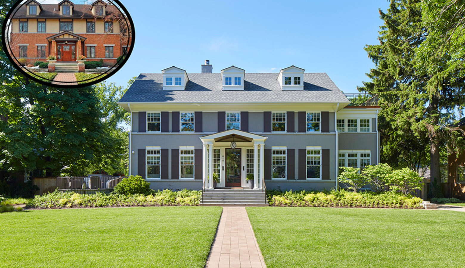
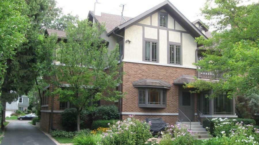
From The Front
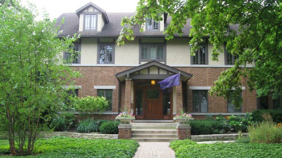
Before: The house had a dark, heavy feel featuring orange colored brick and, to be honest, some unattractive stucco. The windows on the first floor were kind of squatty.
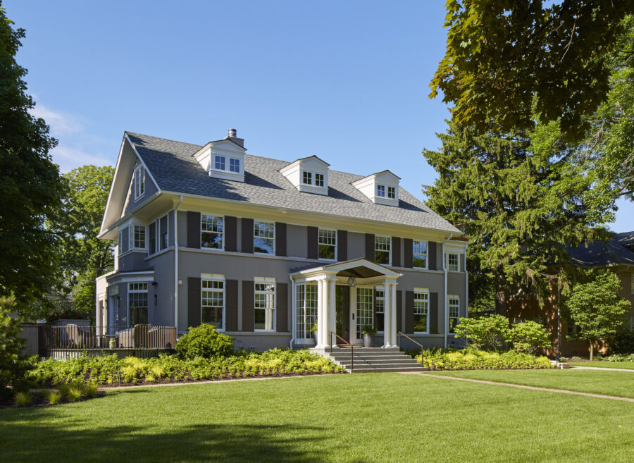
After: First, we painted the brick a pretty shade of gray to lighten things up. Then we altered the shape and scale of the windows, adding transoms and exposed steel headers. We also changed the scale of the dormers on the third floor. White trim and black shutters accent the gray. Now the house looks clean and classic at the same time.
The Stairs
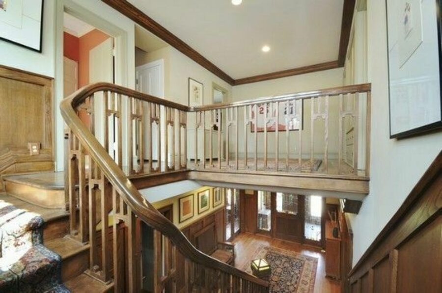
Before: Though a decent example of craftsmanship, the stairs were dark and heavy and not particularly interesting. They ferried you from the first floor to the second floor and that was it.
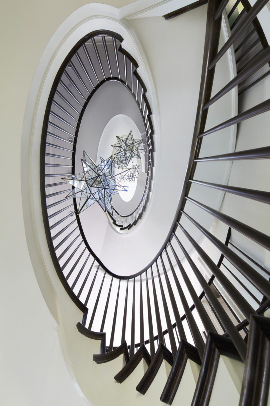
After: I could do a whole blog post on this image alone! It really shows our love for stairs here at MWA. Our idea was to create a new staircase that would knit the house together, all the way from the lower level to the third floor. A single, continuous spiral, it’s sculptural and dramatic – and a pretty cool marvel of engineering. More than that, it’s now the beating heart of the house. It’s the first thing you see when you walk in the front door, and we really wanted to celebrate it. The stair rail is an ebony-colored stain. The balusters are painted dark charcoal. The light fixture cascades all the way down from the skylight at the top, which also helps the stair read as one long element. (That’s architecture and interior design working together, folks.)
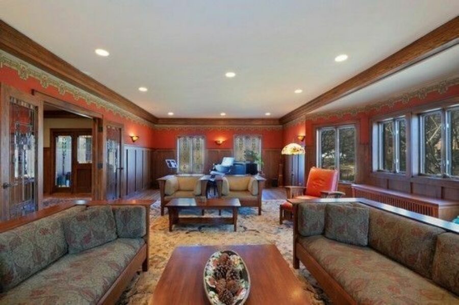
The Den
Before: This used to be a formal dining room. It had some nice detailing but again, wasn’t to our clients’ taste, and didn’t speak to the informal lifestyle they wanted to live.
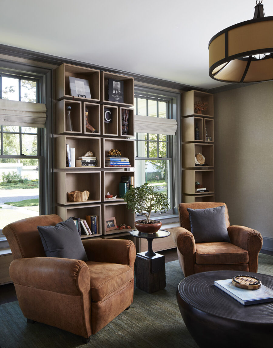
After: We converted the dining room into a library and music room. It’s a place where the family likes to gather to read, play music, and enjoy conversation. To make it a little edgier and less conventional than your average library, we designed custom millwork “boxes” that screw into the walls instead of the usual bookcases. The box idea plays off the grid design of the transom window and repeats elsewhere in the house, which you’ll see in a minute.
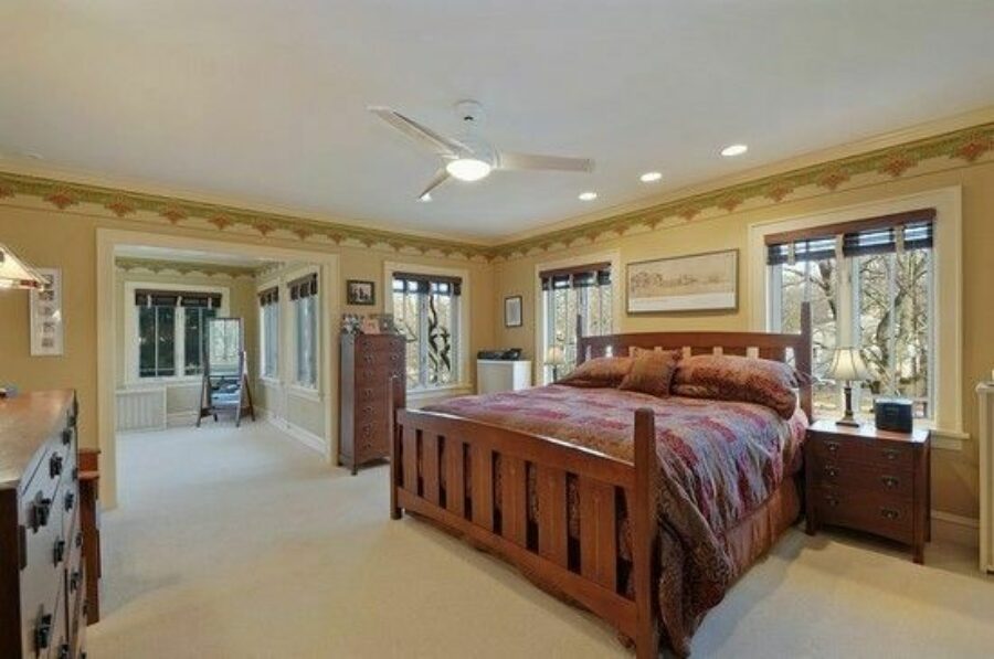
The Primary Bedroom
Before: Again, this was a pretty dark space, and pretty unremarkable.
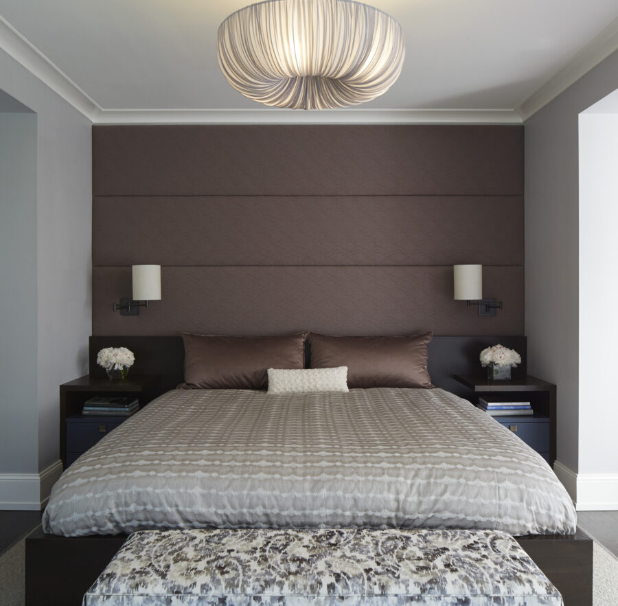
After: The intention was to create a very peaceful, Zen-like space at the back of the house meant strictly for sleeping. It’s not about being an oversize room with lots of superfluous square footage. The upholstered wall makes it cozy and peaceful, and is nice to lean your head against if you’re reading. There’s a small lounge area for morning coffee in front of those lovely windows. There’s also a large dressing room and bath out of view.
The Entry Hall
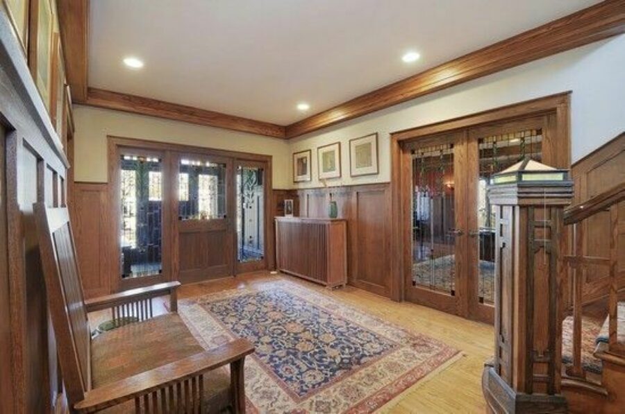
Before: Again, you can see how dark and heavy this used to be. It wasn’t very inviting, to say the least.
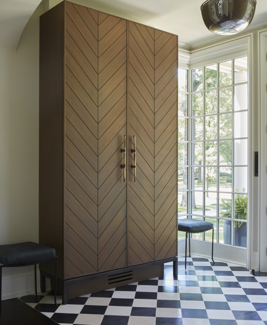
After: This is another jaw-dropper. It went from being sort of foreboding to becoming a glassed-in, light-filled jewel box. There’s so much to talk about here. How about the furniture-style armoires we designed, with their herringbone wood slats and steel legs? They’re mid-century in feel, with an edgy twist, and are so much more interesting than built-in closets would have been. The black and white floor carries the vibe a step further. It’s all very eclectic and gives you a nice preview of what’s to come. (And at night, the whole cube glows.)
From The Back
Before: You can see the original rear of the house was a lot like the front – a bit drab, kind of dark, and not very exciting. There was nothing wrong with it, exactly, but it sure wasn’t what our clients were after.
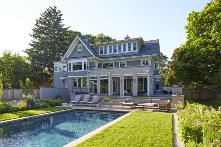
After: If the new front elevation of the house fits in with the neighborhood thanks to its symmetry, the back is more garden-like, picturesque, and even more contemporary. It’s still rooted in history, though: we added a screen porch, and a large dormer on the third floor.
The Living Room
Before: The biggest problem with the formal living room was that it was a formal living room. Which our clients emphatically did not want. They wanted every room in the house to be informal, casual, and used every day. So, we changed this space up big time.
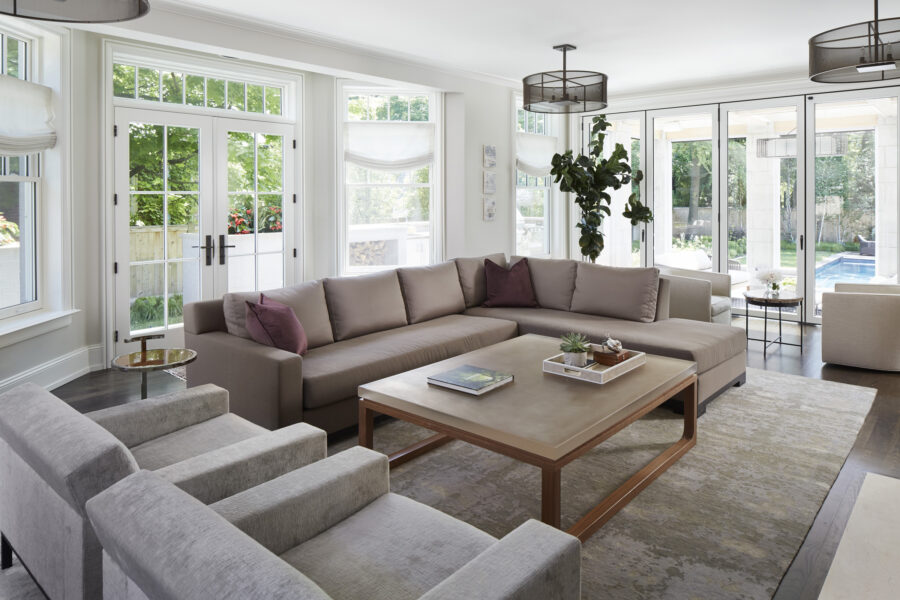
After: First, let me point out that while this after shot looks like a completely different room than before, we didn’t change its configuration at all. What we did do was bring the outdoors in by removing walls and replacing them with fully retractable Nana Walls, which open wide to unite inside and out. The idea was that this is now a family room hang-out space that can play so many roles. You can lower the screens on the porch to shield it from bugs, or raise them and let the outside actually become the inside.
Another clever detail: the TV is hidden behind bi-fold panel doors over the fireplace.
Adding to the versatility of this room is this live-edge table that runs along the entire wall opposite the glass doors. It’s a spot for the family to gather to do puzzles and play board games. It makes a great supplemental dining area for entertaining, too. Again, it’s all super casual.
The Breakfast Room
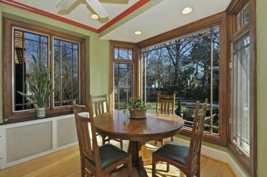
Before: We removed the bay so this space could become part of the new porch addition.
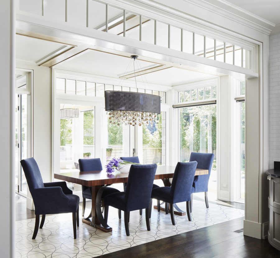
After: You can see why our clients had no interest in a formal dining room. This is the kind of bright, welcoming, unfussy space they prefer to eat in. It’s also very connected to the rest of the house since the center hall ends at this dining table. Notice how it’s anchored by a carefree concrete floor.
The Kitchen
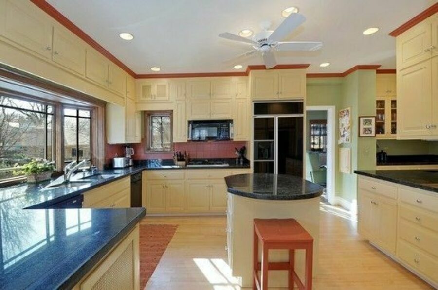
Before: It’s hard to take too much issue with this kitchen, other than the fact that once again, it wasn’t our clients’ taste and it didn’t fit with the way they wanted to live. We donated all the cabinets because they were still perfectly usable, which is always our preference.
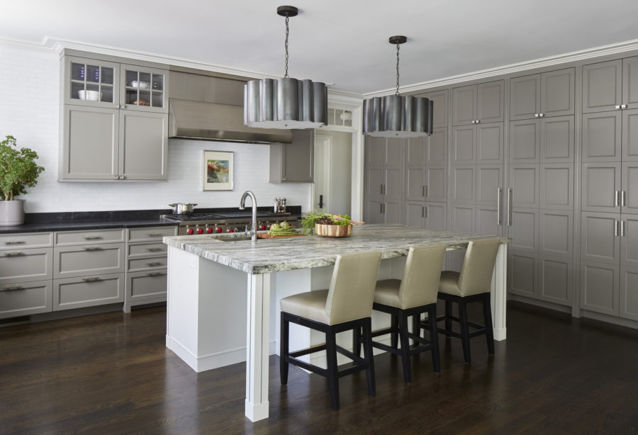
After: This is another great transformation. Today the kitchen feels somewhat contemporary, but it’s still very classic. It’s a lot more open than before, and the materials, finishes, and coloration give it an entirely different aesthetic. It also holds a few clever secrets along the wall of floor-to-ceiling cabinets. The “cabinets” to the far right are actually doors leading to the library. The middle “cabinets” are the refrigerator-freezer. And the far left “cabinets” open up to a desk area that acts as a family nerve center.
Notice the way the cabinet idea repeats in the island base? It ties to the boxes in the library, too. We’re always looking for ways to repeat those kinds of details from room to room, to help a house feel cohesive in a way that makes people feel comfortable – even if they don’t consciously recognize it.
One last thing to say about this remarkable transformation is that none of it would have happened if our clients hadn’t trusted us. Trust, as you’ve heard me say so many times before, is the key to a successful end result. Our clients knew exactly the kind of house they wanted to live in, and at first, had a tough time believing this house could fulfill their vision. But once we explained to them that because the bones of the house were good and the exterior was just a wrapper of sorts, they signed on to the notion that the wrapper could be changed – because they trusted us.
Want to see more examples of what happens when our clients trust us to listen to them and deliver on what we hear? Check out our Instagram and Facebook pages!
Morgante Wilson Architects provides architectural and interior design services in Chicago, Deerfield, Evanston, Glencoe, Glenview, Highland Park, Kenilworth, Lake Bluff, Lake Forest, Northbrook, Northfield, Ravinia, Wilmette, and Winnetka – along with Colorado, Florida, Idaho, Indiana, Iowa, Michigan, New Hampshire, New York, Ohio, Utah, Wisconsin and the U.S. Virgin Islands.